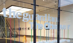
 The Guardian datablog is an international reference when it comes to data journalism, so I jumped at the chance to spend a day with the former head of data visualisation (Adam Frost) and head of creative (Tobias Sturt) from the Guardian’s Digital Agency at a workshop on 22 November. Adam and Tobias now both work for Graphic, a digital agency that specialises in data visualisation and infographics. Adam and Tobias packed an incredible amount of expert advice, examples and exercises into this one-day Masterclass on Data Visualisation. It was also a lot of fun meeting and interacting with a lively group of around 30 journalists and communicators. I promised colleagues that I would share some of the stuff I learned, so here are my seven main takeaways from the workshop:
- Think twice before deciding to go for data visualisation. If you don’t have really compelling data that helps to tell your story, it’s probably better to stick to producing good copy. Putting one number in a circle is not data visualisation!
- Look carefully at the data before deciding on the story. What are the most interesting comparisons (including significant outliers)? How have values changed over time? What can you learn from the composition of the data (eg the breakdown between different categories, countries, regions …)?
- Be selective about the data. Overloading a visualisation will prevent your main messages getting across. The average human can only hold around seven objects in working memory (Miller’s Law). You don’t need to show all of the data. If your story includes many different elements, break these down into “chapters” and guide readers through the content.
- Use visual storytelling to build engagement. Like other forms of storytelling, good data visualisations engage readers using story structure (setup, conflict, resolution …) and dramatic devices (emphasis, contrast, showing rather than telling …).
- Choose the format that fits the data and the story. Different chart types (bar, line, pie, scatterplot, bubble chart, tree chart, timeline …) work with different kinds of data. Maps are always popular, as long as your data includes relevant geographical comparisons. Animations can create a structured narrative and guide your audience through the data you think is most important. Interactive visualisations require more work, but can be useful for complex data or if you want to offer users a more personalised experience where they can play with the data.
- Good design should help the user to understand the story. Colour, fonts, iconography and other design elements all affect the readability of data visualisations. Although visual impact is important to attract reader’s attention, the main job of the design elements is to help people understand the story. As Tobias put it, “There’s no point in being beautiful if you are impenetrable.”
- Producing an effective data visualisation requires collaboration. Different skill sets are required to produce visualisations at each stage of the production process (data analysis, story development, charting, design). Ideally, a data analyst, journalist, web developer and designer should all be involved (although, in practice, this will be a challenge for small communication teams).
Adam and Tobias shared loads of great examples. My favourites were these two from David McCandless:
Overall, the workshop confirmed for me that data visualisation can be an effective addition to our communication toolbox. We just need to make sure that we use it for the right kind of job, and develop the skills to employ it effectively!

